
Black and white photography works when the picture is about shape and gesture, and color adds nothing to the meaning. Shoot in color RAW, then convert to black and white in Lightroom, so you decide how every color turns into a shade of gray.
I'm Olivier Duong. Most of my street photography is in black and white, and for years I delivered black-and-white images to paying clients. This page is the hub for everything on this site about black and white and color. It covers when to use each and how to edit so your photos don't end up flat.
What is black and white photography?
Black and white photography is photography with the color removed, so the image is built from tones between pure black and pure white. Everything in between is a shade of gray. The technical word is monochrome, meaning one color, and in photographic terms it covers any single-hue image. A sepia or blue toned print is monochromatic too, but most people mean neutral gray.
A digital camera records color, and a black-and-white image is a conversion of that color data into grayscale. Black and white film records only brightness. The classic darkroom print is silver in gelatin on paper, which is why museum labels still say gelatin silver print.
Take the color away and the picture is left with light and shape. That is its strength and its danger. There is nothing left to hide a weak composition.
Why is so much street photography in black and white?
Most famous street photographs are in black and white because of tradition, and because monochrome separates the picture from reality. Both reasons still matter today. Robert Frank's The Americans and nearly all of Cartier-Bresson's work are black and white.
Photography started without color. Color film existed early, but it wasn't practical for most people until Kodachrome arrived in 1935. Magazines and newspapers printed black and white photos for decades because color printing cost more. So the photographers everyone studies, from Henri Cartier-Bresson to Garry Winogrand, mostly worked that way, and the people who learned from them copied the look.
The second reason is aesthetic. You experience life in full color. When you see a black and white image, your brain doesn't immediately try to work out where and when it was taken. It reads the photograph as its own thing. Color images sit so close to reality that the viewer goes into detective mode. A man waiting under a station clock in color is a man in a train station. Without color, the same frame can read as a picture about time passing. Black and white abstracts the world just enough to make it feel like a story instead of a record.
Should street photos be black and white or color?
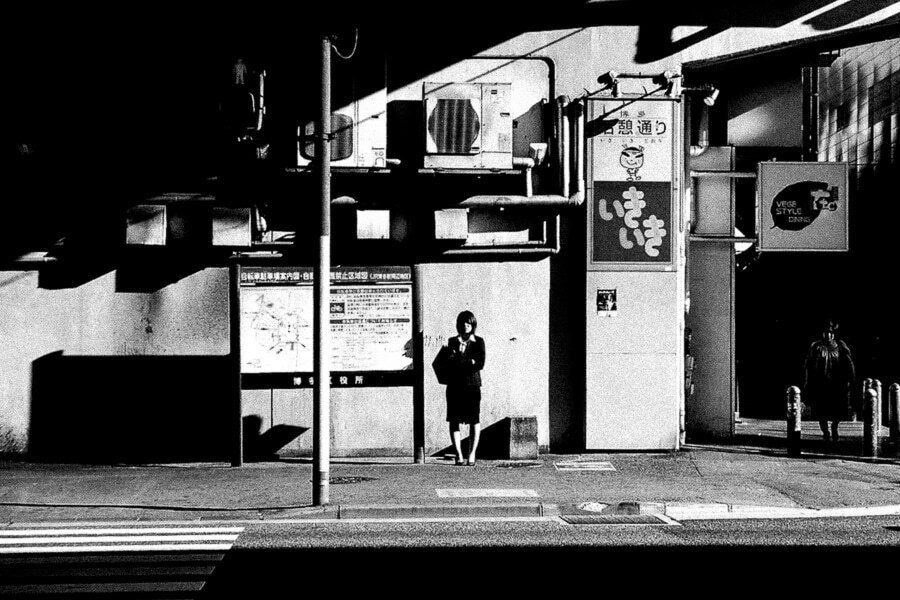
Use black and white when the photo is about shape and gesture; keep color when color carries the meaning. If a red coat or a neon sign is the reason you pressed the shutter, converting it throws away the picture.
Here is the test I use. A great color shot can often make a good B&W shot. The reverse rarely works if the photo was never about color. And if an image looks just as good both ways, the color is probably superfluous, which means it isn't really a color photograph.
A photographer on Reddit admitted: "for a long time I would lean on B/W as a crutch, because it was easy to hide that I wasn't good at working with colour." Plenty of us have done this. Converting a boring color photo makes it look more serious for about five seconds. It doesn't make it better. A weak photo stays weak in gray.
| Choose black and white when | Choose color when |
|---|---|
| The light is hard and makes strong shapes and shadows | A color is the subject, like a red umbrella in a gray street |
| The colors in the frame fight you or distract from the subject | Colors repeat or clash in a way that moves the eye |
| The picture is about gesture or a moment between people | The mood comes from color temperature, like neon at night or golden hour |
| You shot at high ISO and the noise would ruin the colors | The ISO is low and the colors are clean |
| You want a timeless, classic look for a project | You want the viewer to feel a specific place and time |
For the other side of this choice, read my guide to color photography.
What makes a good black and white photograph?
A good black and white photograph has what any good photograph has. I call it the eye, heart and mind. Here, composition and contrast have to work harder because color is no longer there to grab attention.
Think of a child holding a red balloon. In color, your eye goes straight to the balloon. Remove the color and the balloon is just a gray circle. Nothing locks the eye in place except contrast and arrangement. So strong black and white images usually have:
- A full tonal range. Some true black, some true white, a spread of shades of gray between. Not every photo needs it, but most flat conversions are missing it.
- Separation. The subject is lighter or darker than what is behind it.
- Structure. Lines and shapes, plus negative space, that hold together without color.
- A moment worth keeping. A gesture or an expression. Tones can't rescue an empty scene.
The rules behind that structure are in my guide to photography composition. For what separates a keeper from a snapshot, read what makes a good photograph.
Black and white photography tips for beginners
1. Double down on your composition
Nothing exposes the structure of your image more than stripping it of color. If a photo breaks when it's converted to black and white, the reason is usually weak composition. Early on in New York I made a photograph that got a lot of compliments even though I was brand new. All I did was compose it on graphic design principles. When there is no strong subject or color to hold the eye, the picture falls back on composition.
2. Learn to see in black and white
Contrast is one of the best ways to command attention and add depth. Color gives you many options: light blue against dark blue, blue against red, green against yellow. In gray, the main contrast left is light against dark. You are shooting different intensities of black. Learn which ones separate and which ones merge.
3. Watch where your subject sits against the background
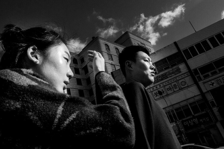
Picture a blue alien in front of a red wall. In color it pops. Converted, both hues might become the same mid gray, and the alien disappears. Before you shoot, ask whether your subject will get lost. I once photographed a woman in dark clothes walking beside a hedge. A step further to the right and she would have vanished into the bushes, because her dark coat and the green leaves turn into almost the same tone.
4. Hunt for hard light
Low sun and slices of light between buildings make crisp shadows, and crisp shadows are what B&W does best. Side light on a face works the same way in portrait photography. My guide to light and shadow photography covers how to find and expose for them. Every good frame is a study in light.
5. Preview in monochrome
Set your screen or electronic viewfinder to a monochrome picture style while you shoot RAW. You capture color and see gray. You see the world in tones while the file keeps every color.
6. Don't fear grain
Noise that ruins color can look like film grain in gray. At night, a grainy frame beats no frame.
Best camera settings for black and white photography
You don't need a special camera. Any digital camera works, from a DSLR to a phone, and RAW capability is the one thing I strongly recommend.
- Shoot RAW. The file keeps all the color information, so you decide later how each color becomes gray.
- No RAW? Shoot color JPEG. Never a monochrome JPEG, because you can't get the color back.
- Set a monochrome picture style so the screen shows tones. Some cameras only allow this in RAW+JPEG mode.
- Keep ISO as low as the light allows, but raise it before you let the shutter speed drop and blur the moment.
Yes, the secret of great black-and-white photography is to shoot in color first. The magic happens in post-processing and image editing.
Two exceptions. The Leica M Monochrom has a sensor with no color filter array, so it records only brightness and gives very clean files. And in analog film photography, black and white film such as Kodak Tri-X or Ilford HP5 in 35mm records only tones. Film shooters put a colored photographic filter on the lens to change how each color turns to gray. A red filter darkens a blue sky dramatically. Ansel Adams used one in Yosemite National Park for Monolith, the Face of Half Dome in 1927, turning the sky almost black. That photograph is one of the reasons landscape photography and black and white are so linked. In digital photography, RAW files give you the same control after the fact. My street photography settings guide covers exposure and focus.
How to convert to black and white in Lightroom or Photoshop
Convert in Lightroom by switching to a black and white profile, then use the B&W mix to make each color lighter or darker. That second step is the one most people skip, and it's where the creative control is.
Once a photo is in color, you can tell Lightroom to turn different colors into different shades of gray. A B&W JPEG can't do that. Look at this frame from Osaka:
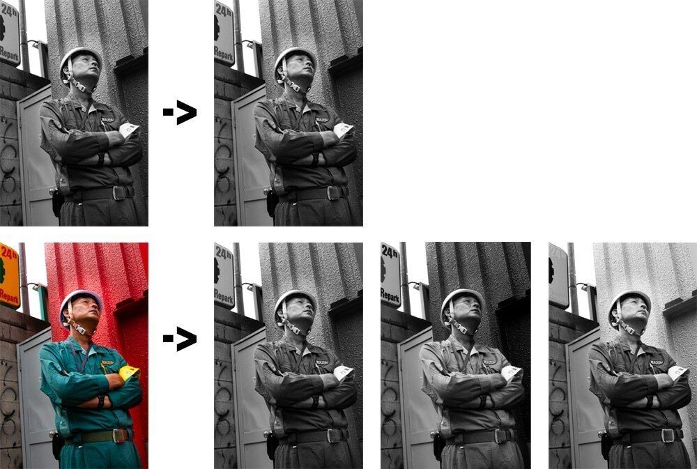
Notice the red background and the man's shirt. Had I shot a B&W JPEG, I'd be stuck with whatever gray the camera chose. Because I shot in color, I can get a straight conversion and also darken or lighten the background or the shirt on their own. To edit them in black and white:
- Pick a black and white profile. In the Develop module, click Black & White in the Basic panel, or choose a profile like Adobe Monochrome.
- Set exposure and the white point. Get the brightest important area bright but not blown.
- Move the B&W mix sliders. Orange controls most skin, blue controls the sky. You are telling Lightroom: I want my reds darker, my blues lighter.
- Add contrast with the tone curve. A gentle S curve deepens blacks and brightens whites, which adds depth.
- Dodge and burn with masks. Lighten the subject, darken edges and distractions. This is the old darkroom trick, done with brushes and gradients.
- Add grain if you like it, plus a light vignette to hold the eye in the frame.
In Photoshop, a Black & White adjustment layer does the same mixing by hue. The steps are the same in Photoshop or Lightroom. My full workflow, from culling to export, is in how to edit street photography. If you shoot Fujifilm and prefer JPEGs, my Fujifilm recipes page has monochrome settings, though you give up the color mix.
High contrast black and white vs flat gray
High contrast black and white photography pushes the tones to deep blacks and bright whites, with fewer grays between. It's graphic and creates a dramatic mood. Daido Moriyama built a whole style on grainy, contrasty frames, and Josef Koudelka's hard blacks are another benchmark. See my notes on Josef Koudelka.
The more common problem is the opposite. On Reddit, one critique put it bluntly: "most of your B&W edits are very flatly edited." A straight conversion often looks muddy because all the colors fall into similar middle grays. The fix is the B&W mix plus a curve. Separate the subject from the background first, then decide how far to push.
Don't overcook it either. Crushing every shadow and clipping every highlight kills texture and faces. Push contrast until the subject pops, then back off a little.
Black and white prints: paper and editions
A print is where a black and white photo feels most finished. Screens show blacks as glowing dark gray. Paper shows a real black. If you care about a photo, print it.
- Paper. Matte fine art papers give soft, deep blacks. Glossy and baryta papers give more punch. Try both with the same file.
- Print a little brighter than your screen. Most home screens are too bright, so first prints often come out dark.
- Neutral or toned. Some printers add a slight warm or cool tone. Sepia is the classic warm one.
- Open edition or limited edition. If you sell fine art prints or art prints, an open edition has no limit and a limited edition has a fixed number. That is a business choice, not a quality one.
Plenty of photographers see photography as an art form first because of the black and white print. A good one hangs on a wall for decades.
Black and white and color guides on this site
This page is the starting point. Each guide below goes deeper into one part of working in tones or in color.
- Color photography: how to use color on purpose, with color coordination and color contrast.
- How to edit street photography: a simple Lightroom workflow from culling to export.
- Rain photography: how to shoot streets in bad weather, with reflections and umbrellas.
- Light and shadow photography: hard light and silhouettes, the raw material of work in black and white.
- Fujifilm recipes for street photography: in-camera looks, including monochrome ones.
- Ricoh GR recipes: gritty, high contrast black and white settings straight out of the camera.
- Saul Leiter: the painter who photographed New York in color through glass.
- Ernst Haas: color in motion, from a photographer who started in monochrome.
Learn to see in tones before you shoot
The conversion is the easy part. Seeing a scene in tones before you raise the camera is the skill, and it comes from training your eye on light and composition until it runs on autopilot. That is what my online street photography course is built on. It includes a module on editing your images with the simple tools you'll use most of the time, and more than 10 ways to contrast elements in a frame. Contrast is what black and white lives on. More photography tips on contrast are in the guides above.
Frequently Asked Questions
What is a black and white photograph called?
It is usually called a monochrome photograph. Monochrome means one color, so strictly it also covers sepia and other toned prints. You will also see grayscale for digital files and gelatin silver print for traditional darkroom prints made on light sensitive paper. In everyday use, B&W and monochrome mean the same thing.
What makes a good black and white photograph?
Strong composition and clear contrast around a moment worth keeping. Without color, the eye has only brightness and shape to follow, so the subject must separate from the background by being lighter or darker. Most good black and white photos have some true blacks and some true whites, with a range of grays between them.
Should I shoot in black and white mode or convert later?
Shoot RAW and convert later. A RAW file keeps all the color information, so in Lightroom you can choose how each color turns into gray, for example darkening a blue sky or lightening skin. Set your screen to monochrome for the preview if your camera allows it. A B&W JPEG locks you into the camera's choices.
Does black and white photography still exist?
Yes, and it is thriving. Many street and documentary photographers work mainly in monochrome, and so do plenty of fine art photographers. Film such as Kodak Tri-X and Ilford HP5 is still made, and Leica sells digital cameras with monochrome-only sensors. Every photo editor, from Lightroom to phone apps, includes conversion tools.
What is the meaning behind black and white photography?
Removing color leaves only light and shadow, so contrast becomes the main thing the eye sees. It also separates the photo from everyday reality, since we see the world in color. The viewer stops asking where and when it was taken and reads the image as a story about emotion and gesture instead of a record of a place.