
A good photograph has a clear subject and a reason to exist, arranged so the eye goes straight there without clutter. It also makes you feel something, which is why a technically perfect photo can still be forgettable.
I'm Olivier Duong. For years I edited a photography magazine with Don Springer, which meant looking at the work of hundreds of photographers and deciding which ones made the cut. When I started out, I couldn't tell if my own pictures were good. Many photographers feel the same. One Reddit user asked strangers to "just lay it on me. Tell me if my photos suck", because ChatGPT "kinda feels like it tells me what I want to hear."
You don't need a stranger's verdict. You need a way to judge a photo yourself, and that's what the checklist and the critiques of my own photos are for.
What makes a good photograph?
What makes a good photo is that it works on two levels at once: it looks organized, and it moves you. Composition catches the eye. Emotion and meaning make the viewer stay. Everything else is a creative option you pick to serve what you want to convey.
I describe it with a model I call the Eye, Heart and Mind. The eye is composition, light and form. The heart is emotion. The mind is intent and thought, the reason the photo exists. Most photos get one of these right. The great photo, the one you remember for years, has all of them lined up in one frame.
Composition alone does not make a good photograph. I learned that the hard way. My early pictures were clean because I trained as a graphic designer, yet they were sterile. They made people go "wow" for one second and then they were forgotten.
The 10-point photo critique checklist
Run any photograph through these 10 questions. A strong image passes most of them. A weak one usually fails the first two.
| # | Question | What a good photograph does |
|---|---|---|
| 1 | What is the subject? | One clear focal point you can name in a few words |
| 2 | Why does this photo exist? | It has intent: a moment, a feeling, an idea or a visual joke |
| 3 | Where does the eye go first? | Straight to the subject, pulled by contrast or light |
| 4 | Is the background helping? | No distracting background elements steal the viewer's attention |
| 5 | What is the light doing? | Light shapes the subject, from soft light on a face to hard shadows |
| 6 | Is there a moment? | A gesture or glance that won't happen again |
| 7 | Is it arranged? | Shapes and repetition look ordered, not random |
| 8 | Does it make you feel something? | An emotion or a question lingers after you look away |
| 9 | Is it well executed? | Exposure and focus serve the idea, even if not technically perfect |
| 10 | Is it a cliché? | It shows the world in a way you haven't seen a hundred times |
Questions 1 and 2 matter most, because the choice of subject decides everything after it. An interesting subject shot badly still beats a well balanced frame of nothing. If you can't name the subject or the reason, no amount of post processing will save the frame. If your photos keep failing there, read why your street photos look boring.
Is the rule of thirds what makes a photo good?
No. The rule of thirds is a starting point, not the reason good photographs work. Plenty of great photos put the subject dead center, and many poorly composed photos follow it exactly.
When I look at a strong, well-composed image, the thirds grid rarely explains it. What explains it are deeper principles from design and perception. Two of them are worth learning right away:
- Law of proximity: things placed close together are read as a group. Two strangers standing near each other become a pair, and the viewer starts inventing a story.
- Law of similarity: things that look alike are linked by the eye. A repeated color, shape or gesture makes a street scene look composed on purpose.
In street photography, composition means bringing visual order to a chaotic street. My formula is simple: composition equals visual elements times arrangement principles. The elements are things like line, shape, space, color and texture. The arrangement principles decide how they sit together. A leading line and a layered frame are both versions of this. See photography composition for the full picture.
Light: the photographer's paint
Light is the second biggest visual difference between a great photograph and a snapshot, right after composition. The word photography literally means drawing with light, so learn light the way a painter learns paint and a brush. Painting and drawing have studied light for centuries, and the visual arts are a great place to steal from.
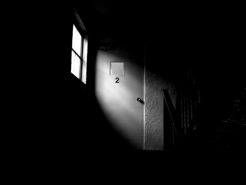
Notice the quality of light at different times of day. Overcast light is softer and kind to faces. Low sun gives long shadows and hard edges. A single light source in a dark room creates drama. When in doubt, expose for the highlights and let the shadows go black rather than overexpose the bright parts.
Landscape photography teaches this well, because landscape photographers wait hours for the sky to change. Street photographers can't wait that long for one scene, but they can learn where good light falls in their city. The same goes for travel photography: the best pictures from a trip usually come from the hours when the light is low.
Emotion: does the photo make you feel something?
A good photograph makes the viewer feel something, and that feeling is what makes it memorable. Beautiful light and a clean frame get attention. Emotion keeps it.
Alfred Stieglitz photographed clouds and called them Equivalents, pictures meant to stand for feelings. When asked if they were just pictures of clouds, the point he made was that the feeling mattered more than the subject. Photography is an art in that sense. The subject is the vehicle, not the destination.
Roland Barthes gave us two useful words in his book Camera Lucida. The studium is the general interest a photo holds, its subject and context. The punctum is the small detail that pricks you personally: a hand, a glance, a torn sleeve, a stray dog. The best photos often have a punctum you can't fully explain.
Minor White believed that almost everything has already been photographed, so what makes your picture different is the heart behind it. I agree. We share the same world and the same cameras. Your reason for pressing the shutter is the one thing nobody else has.
The moment: timing and storytelling
In street photography, the moment is often the difference between a good photograph and a record. To tell a story, a photo needs something to happen in it: a look, or two people who don't know they mirror each other.
Henri Cartier-Bresson described it as "the simultaneous recognition, in a fraction of a second, of the significance of an event as well as of a precise organization of forms." My simpler version: the decisive moment is when what you see and what you feel line up in one frame.
Luck plays a part, and that's fine. Cartier-Bresson himself said his famous photo behind the Gare Saint-Lazare was taken through a gap in a fence where he couldn't see much. You still had to be there, camera ready.
How much does technical skill matter?
Technical skill matters only until it stops getting in the way. A photo needs to be sharp enough and exposed well enough to carry its idea. Beyond that, a well-exposed but empty photo loses to a slightly soft photo with a real moment.
Cartier-Bresson is often quoted as saying "sharpness is a bourgeois concept." He had a point. Learn shutter speed and the ISO setting well enough to stop thinking about them. Use shutter priority or aperture priority if it helps. Depth of field and film speed are tools, not goals.
Genre changes what "technical" means. Sports photography needs fast shutter speeds and long lenses. Architecture and landscapes often need a tripod. Street photography mostly needs a small camera and the nerve to get close to your subject. Changing your angle often does more than changing a setting. For practical numbers, see my street photography settings guide.
Three worked critiques
I ran three of my own street photographs through the checklist. I'm harder on my own work than on anyone else's. A bad photo teaches you as much as a good one, as long as you can say why it failed.
Critique 1: Shopkeeper, Nicaragua

Subject: the man on the right. His gaze into the lens is the focal point. Arrangement: the pile of shoes fills the lower half and leads across the frame to him. The clock and the hanging scale fill the top without competing. Light: the overhead tube lights the pile and the back wall, so the dark shop still reads. Weakness: he stands right at the edge and the left half is crowded. A step to the left would have given him more room.
Critique 2: Two women and a jerrycan, Haiti
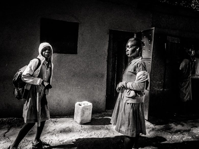
Subject: the relationship between two people, not either one alone. Arrangement: the law of similarity links them, since both wear head coverings and face each other. The jerrycan sits in the gap and becomes a small punctum. Light: hard sun with deep shadows gives the frame weight. Weakness: the dark wall at the top adds little.
Critique 3: Backlit crossing
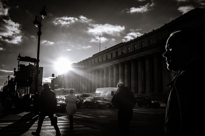
Subject: the light itself, with the crowd as shapes. Arrangement: the profile in the right foreground frames the scene and adds depth. The long line of columns leads the eye to the sun. Emotion: it has the feel of a commute. Weakness: it's closer to a mood than a moment. Nobody in the middle does anything special, so it passes the eye test and only half passes the heart test.
How to critique your own photographs
The hardest photos to judge are your own, because you remember how it felt to take them. To critique your own work, put time between shooting and judging, then run the checklist cold.
As an editor I noticed that photographers misjudge about 20% of their own images. They overrate the ones that were hard to get and underrate quiet ones. I call the fix getting a divorce from your work. Leave the files alone for weeks or months. When the high of making the image fades, you see the photograph instead of the memory.
- Look at the thumbnail first. If the photo reads at stamp size, the composition is strong.
- Cover parts of the frame with your hand. If nothing changes, those parts add nothing.
- Ask someone from another place to look. When I edited my own Haiti photos, a friend pointed out that people carrying loads on their heads looked striking to outsiders. To me it was normal.
- Don't trust likes. A photo can be good even if few people like it, and popular photos are often clichés.
- Look at a series of images together. A single frame can mislead you, but a set shows your consistency.
How to get better at judging photos
You become a better photographer by studying good photographs until you can explain why they work. For the habits that turn that knowledge into pictures, see how to take better photos. Every time you can name why a frame works, you get closer to being able to take a great photograph on purpose, not by luck. Reading about composition helps, but watching someone take a photo apart is faster.
That's what the Image Vault bonus in my street photography course is for. we pick apart 10 winning images: what happens when you remove small elements, and where the eye goes first. You watch 10 images critiqued. It is not a review of your own photos, and the course does not include personal feedback. Another bonus covers 18 psychological principles, including how to judge your own work more accurately.
If you're new, start with street photography for beginners and use this checklist on the photographers you admire before you use it on yourself.
Frequently Asked Questions
What are the key elements of a good photograph?
The key elements are a clear subject and a reason for the photo to exist. The arrangement should send the eye straight to that subject. Good light and a clean background support that. The best photographs also carry emotion or a moment. Technical quality matters only enough to carry the idea.
How do you critique a photograph?
Start with two questions: what is the subject, and why does this photo exist? Then check where the eye goes first, whether the background helps, what the light is doing, and whether there is a moment. Finish by asking how it makes you feel. Be specific. Name what works and one thing that would make it stronger.
Does a good photo have to follow the rule of thirds?
No. The rule of thirds is a useful starting point but many great photographs ignore it. Strong images are usually explained by contrast, repetition, grouping and where the eye travels. Centered subjects can be powerful. Learn the rule, then learn the principles underneath it, and break it when the photo needs it.
What makes a photo interesting?
A photo is interesting when it shows a moment or a detail the viewer wouldn't notice alone. Interesting photos often contain contrast, such as light against dark or old next to young. They leave a question open. An ordinary subject can be fascinating if the timing and arrangement are right.
Does a good photograph need to be sharp?
Not always. It needs to be sharp enough to carry its idea. A slightly soft photo with a real moment beats a sharp photo of nothing. Motion blur and grain can add feeling. That said, if most of your photos are blurry by accident, raise your shutter speed before you blame your eye.