
Photography composition is how you arrange the elements inside the frame so the viewer's eye goes where you want it to go. The composition rules that matter most control where the eye lands first and how it travels, and the rule of thirds is only a starting grid, not a law.
I'm Olivier Duong. I was a trained graphic designer before I picked up a camera, and I still see composition in photography as graphic design: taking the chaos of the street and bringing visual order to it. A well composed photo feels like the photographer knew what they were doing. A snapshot feels like the camera went off by accident.
Reddit asks the same question every week: "How do I find compositions? Am I shooting too tight?" You don't need a longer list of rules. You need a handful of principles you can see fast enough to use while people are still walking.
What is composition in photography?
Composition is the act of arranging visual elements in an elegant manner. Your job as a photographer is to make an image of a messy world look as if it was constructed by hand.
The brain reads some arrangements as orderly. Look at the two sides of the diagram below and ask which one looks composed.
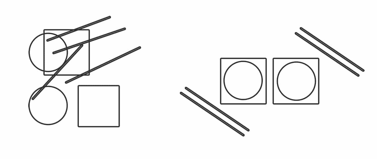
It is the right one, because it follows a pattern. In this case the pattern is "like with like": circles sit inside squares, and the lines run parallel. Nothing new was added. The same parts were arranged.
The word composition comes from music and the visual arts. A composer arranges notes into rhythm and harmony. A photographer arranges shapes and tones. Both are trying to hold your attention from start to finish.
That is the whole game. Photography composition does not mean following a checklist of compositional rules. It means knowing the patterns the brain finds pleasing and then spotting them in front of you. A camera turns a deep, moving world into a flat, two-dimensional rectangle. The composition of a photo is how you rebuild a sense of dimension and order inside it.
Why composition matters more than your camera
Composition is one of the biggest things that separates a snapshot from a photograph. Two people can stand on the same corner with the same camera. The one who composes will come home with the better picture nearly every time.
Think of yourself as the director of the image. You decide what the viewer sees and in what order. If the eye has nowhere to go, it leaves. If it travels from the main subject to a second point of interest and back, it stays. Good composition lets you guide the eye into the scene and hold the viewer's attention long enough for the feeling in the picture to land.
The strongest compositions do one job well: they make the main subject impossible to miss. Everything else within the frame either supports that or steals from it. Simplicity and clarity beat cleverness.
A line usually credited to Edward Weston puts it well: "Composition is the strongest way of seeing." Gear changes how the picture looks. Composition changes what it says.
The elements of composition: visual elements times arrangement principles
Here is the idea I built my teaching on:
Composition = Visual Elements x Arrangement Principles
The visual elements are the raw material. In our street photography course we teach six of them, including line, shape, space, color and texture. Every scene on earth can be broken down into these, and each compositional element carries weight of its own. A crowd becomes a set of vertical shapes. A row of houses becomes a straight line.
The arrangement principles are what you do with that material. Repetition is one. Contrast is another. Grouping similar things together is a third. We teach eight of them, and they work like grammar. Without grammar, words are noise. Without arrangement, elements are clutter.
I have rarely seen these principles taught outside graphic design circles. Painters know them. Most photographers pick them up by accident, if at all.
Learn to see in shapes
When there are too many things in the frame, the brain simplifies. It stops seeing each detail and sees broad shapes first. A guy on a bike with his kid is not a guy on a bike. It is a vector pulling toward the bottom left.
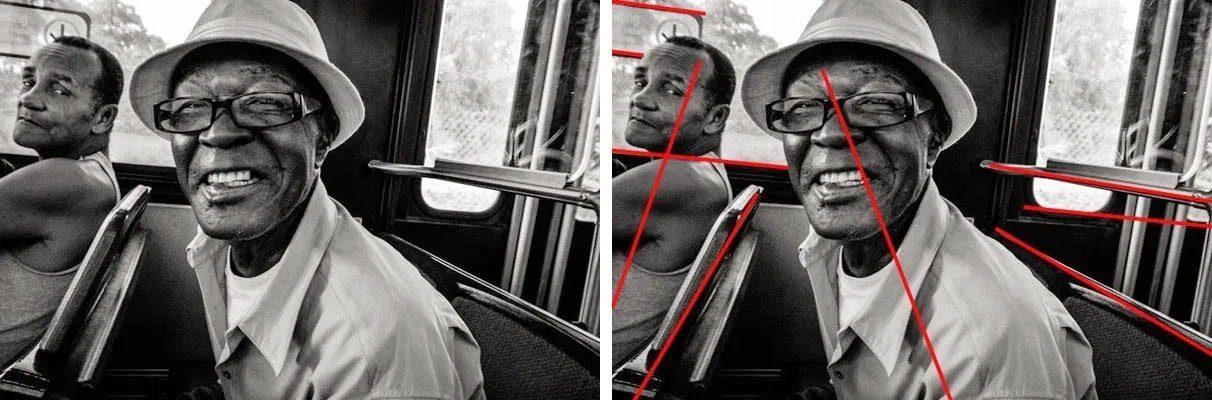
So train yourself to squint at a scene and look for the skeleton of the image: the big shapes and the blocks of light and dark. That skeleton decides how the photograph works before you even look at the subject.
Photography composition rules and techniques that matter on the street
These are the composition techniques I use and teach, roughly in the order you should learn them.
1. Pick one main subject and give it a strong point of interest
Before anything else, decide what the photograph is about and what story you want it to tell. The main subject is your focal point. If you cannot point to it in one second, the viewer cannot either.
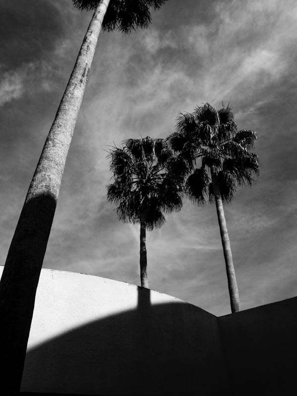
With a wide lens there is always other stuff in the frame. I wanted one palm tree, but other trees were in the way. So I moved until a shadow on the wall behind lined up with the tree I cared about. The shadow points to it.
2. Watch the background
In The Magnificent Seven, Steve McQueen was not the lead. Yul Brynner was. But McQueen kept fiddling with his gun and his hat, and he stole scene after scene. Your background does the same thing. Once you know your subject, the background becomes the most important element. It either adds to the subject or takes from it. Move left, right, up or down until no objects in the background compete with the subject. Change your perspective before you change your settings.
3. Use contrast
Contrast is the most powerful visual principle I know. It is the difference between two things: light and dark, big and small, still and moving, saturated and gray. The energy between the two extremes is what pulls the eye. Start with light and dark. The light and dark areas of a frame decide where the eye goes. A light figure in a dark frame will be seen first, every time. Focus does the same: the sharpest thing in the frame draws the viewer's eye before anything soft.
4. Group like with like
The law of similarity says the brain links things that look alike. Two people in matching clothes, a red coat next to a red sign. When you repeat a shape or a color, the frame gains order and rhythm. It is one of the simplest ways to add interest to the image. The law of proximity works the same way with distance: things close together are read as a group.
5. Use leading lines
Roads, rails, curbs, shadows and the direction someone is looking all move the eye. Point them at your subject, not out of the frame, and they lead the viewer's eye exactly where you want it. The full guide is here: leading lines in photography.
6. Put a frame within a frame
A doorway or overhanging tree branches around the subject shrink the frame without cropping, and whatever is inside it pops. See framing in photography.
7. Leave empty space on purpose
Negative space is the space around the subject. A single figure against a blank wall or open sky reads instantly. More in negative space photography.
8. Build depth with layers
Put something in the foreground and something further back, and let each layer hold its own point of interest. This is the hardest of these to pull off. See layering in photography.
9. Place two ideas side by side
Juxtaposition puts two elements next to each other so they comment on one another: old and young, a sign and the person under it. See juxtaposition photography.
10. Balance visual weight
Some elements are heavier to the eye: faces, bright areas, saturated colors, text. If you have a heavy object in the top left corner, look for something in the bottom right to balance the scene. A symmetrical frame is balanced by default. It is also static, so use symmetry when you want calm.
The rule of thirds: a starting grid, not a law
The rule of thirds divides the frame into a 3 by 3 grid with two horizontal and two vertical lines. You place the main subject on one of the lines or where two of them cross, and you put the horizon on the top third or the bottom third instead of the centre of the frame.
The name goes back to the painter John Thomas Smith, who wrote about it in 1797, and it is still the first rule of composition most people learn, in landscape photography as much as on the street. It works because it stops beginners from putting everything dead centre. Most cameras and phones can show a rule of thirds grid on screen, so it is easy to try.
My opinion: it is overrated as an explanation. Other photography material will tell you a good image works "because of the rule of thirds." Usually the real reasons are frame dynamics, the law of proximity, the law of similarity and mid-point tension. The subject happened to land near a third.
Use the grid as training wheels. Using the rule of thirds for a month will teach you to stop centering by habit. Then drop it and place the subject where the lines, light and space in the scene tell you to.
Golden ratio photography and the Fibonacci spiral
The golden ratio is a proportion of about 1 to 1.618. In photography it shows up in two ways. The phi grid is like a rule of thirds grid, but the lines sit a little closer to the centre. The golden spiral, built from Fibonacci numbers, curls toward one point of the frame where you put the subject.
Painters and architects have used these proportions for centuries, although some famous examples are debated. In practice the golden ratio and the rule of thirds put your subject in nearly the same place. Do not measure spirals in the field. If a spiral shape exists in the scene, like a staircase or a curving road, use it as a leading line.
In the course we start with basic composition patterns like the golden rule, then move to the principles that explain why a frame works. The patterns get you started. The principles let you compose when no pattern fits.
Street photography composition is different
A landscape photographer can wait for the light, set up a tripod and walk around the scene. A portrait photographer can move the model. In macro photography you can nudge the subject a few millimetres. On the street, nothing waits for you.
All forms of photography share the same visual rules. What changes is how much control you have. You cannot arrange the elements in a photo on the street. You arrange yourself. You change where you stand and when you press the shutter until the scene lines up.
Find the stage, then wait for the actor
Often I find a good background first, like a wall with strong light or a line of shadows. Then I wait for someone to walk into it. The composition is already done. The person completes it.
Depth of field and bokeh
With a long lens and a shallow depth of field, bokeh does the work for you: the background blurs and the subject pops. With a 28mm or 35mm lens at f/8, almost everything is sharp. You have to lead the eye with lines and light instead. It is harder, and it will make you a better photographer. My street photography settings page covers the exposure side.
Crop and aspect ratio
Get it right in camera when you can. If you shoot with a zoom, remember that zooming changes the frame but not the perspective, so walking closer still gives a different picture. The crop is a real composition tool too. Cutting a 4:3 frame to 3:2 can remove a distracting element at the edge of the frame. Check the edges of your frame before you press the shutter. Most distractions live there.
How to improve composition
- Study painters, not only photographers. Painters and engravers were solving composition problems centuries before the camera. The Portuguese photographer Jorge Silva told Inspired Eye the same thing: don't just stare at photographs. The course includes a bonus on the Renaissance masters for this reason, and beauty in those paintings is rarely an accident.
- Trace the eye path. Look at your photo and ask: top to bottom, left to right, where does the eye go first, and where does it leave?
- Pixelate your photo. Shrink it to a thumbnail or blur it. If the main subject still stands out as a clear shape of light or color, the composition works.
- Learn one principle a week. Go out looking only for leading lines. Then only for frames. Your brain will start spotting them without being asked.
- Work the scene. Take more than one frame. Move a step, lower the camera, wait for the next person. Most keepers are the fifth frame, not the first.
- Cull hard. Keep the frames where the subject is clear and the eye travels. Delete the ones you have to explain.
There is no perfect composition. The best composition for a scene is the one that makes your subject clear and your point felt. An interesting composition that says nothing is still an empty photo.
If your photos still feel flat after all this, the problem is often not composition at all. Read why your street photos are boring and what makes a good photograph. If you are new, start with street photography for beginners.
When to break the rules
Know the basic rules first, then break them on purpose. Even the most common composition patterns fail when they fight the scene. A centred subject can be powerful when the frame is symmetrical. A horizon in the middle can work when the reflection below matters as much as the sky above. A tilted frame can add tension.
The test is simple. Does the break make the main subject stronger, or does it just look different? If you cannot say what the break adds, it is a mistake, not a choice.
Composition is also only one part of a good photograph. I think of every image in three parts: the Eye (composition), the Heart (the emotional charge) and the Mind (the technical and psychological side). My images only started to connect with people when I stopped treating the Eye as the whole job.
Composition guides on this site
- Leading lines photography: lines that pull the eye to the subject.
- Framing in photography: frames within frames.
- Negative space photography: the power of the empty part.
- Layering photography: foreground, middle and background working together.
- Juxtaposition photography: two elements that comment on each other.
- Light and shadow photography: using light as a shape in the frame.
- Elements of photography: the visual building blocks every frame is made of.
- Gestalt principles in photography: why the eye groups some shapes and ignores others.
- Work the scene: keep shooting one situation until the composition clicks.
- How to see like a photographer: train your eye to spot pictures before you raise the camera.
- Emotion in street photography: when feeling matters more than perfect geometry.
- Composition lessons from painters: what the old masters knew about arranging a frame.
Want the full system? Phototactic starts with photography basics for beginners in a bonus camera course. Module 3 of Phototactic, our online street photography course, teaches the 5 laws that make people look where you want them to. It also covers the elements and arrangement principles in depth, with cheat sheets you can keep on your phone.
Frequently Asked Questions
What are the rules of composition in photography?
The most useful rules control where the eye goes first. Pick one main subject, keep the background clean, use contrast, group similar shapes and colors, use leading lines and frames, leave negative space and balance visual weight. The rule of thirds and the golden ratio are placement guides that help beginners stop centering everything, but they do not explain why a strong image works.
What are the 7 rules of composition?
There is no official list. Seven that often appear are the rule of thirds, leading lines, symmetry, framing, negative space, balance and simplicity. Lists of 5 or 12 rules are just different cuts of the same ideas. It is more useful to learn the principles underneath them, such as contrast and similarity, because those explain why every rule on the list works.
Is the rule of thirds necessary for good photography?
No. The rule of thirds is a helpful starting grid that stops beginners from centering every subject. Many great photographs ignore it. When an image seems to follow it, the real reasons it works are usually contrast, grouping and where the lines in the scene point. Use the grid for a while, then compose from what the scene gives you.
What is the difference between composition and framing?
Composition is the whole arrangement of elements in the photograph. Framing has two meanings. It can mean choosing what goes inside the edges of the frame, which is part of composition. It can also mean the frame within a frame technique, where a doorway or a window surrounds the subject. Both are tools inside the bigger job of composition.
How do I improve my photography composition fast?
Pick one principle per week and look only for that on every walk, for example leading lines one week and frames the next. Check the four edges of the frame before each shot. Review your photos by asking where the eye goes first. Study paintings as well as photographs. Cull hard and keep only images with a clear main subject.
Does composition matter in street photography?
Yes, and it is harder than in landscape or portrait photography because you cannot move the subject. You compose by changing your position and your timing. Many street photographers find a strong background first, then wait for a person to walk into it. Good composition is what turns a photo of people walking into a street photograph.