
Painters teach photographers how to decide where the eye lands first. They do it with light and placement, and both tools work on the street with any camera.
I'm Olivier Duong. I learned composition as a graphic designer before I learned it as a street photographer, and the old masters are still where I go when my photos feel flat. A painter can't wait for a lucky frame. Every inch of the canvas is a decision. That makes a great painting a solved composition problem you can study at your own pace. A photographer on Reddit put it well: "The bit about learning the vocabulary to articulate why an image works really resonated with me." Painters give you that vocabulary.
Why painters see composition better than most photographers
A few years ago my friend Don Springer and I coached a group of street shooters. One of them was a painter. Their photos were ahead of everyone who started from scratch, and the reason was simple: they already knew that everything visual can be reduced to a handful of simple visual elements. They saw a scene as shapes and tones before they saw it as "a man on a bench".
That habit has a long history in photography. Henri Cartier-Bresson studied painting under the cubist painter André Lhote in 1926, according to the Fondation Henri Cartier-Bresson. In 1931 a photograph by Martin Munkácsi made him decide to focus on photography. He kept the painter's eye for geometry for the rest of his career, which is part of why his frames feel built rather than found.
You don't need to pick up a brush. You need to look at paintings the way a painter looks at the world: structure first, subject second. The lessons are plain photography composition, seen through art history.
Lesson 1: See the skeleton before the subject
Painters block in big shapes before they paint a single face. The world is complex, but it's built from simple parts. A street scene is too: a rectangle of shadow, a triangle of light, the circle of a hat brim, the long line of a curb.
I call these shapes the skeleton of the image. Like the foundation of a house, the skeleton decides how the photo looks before the subject even walks in. People read broad shapes first and details second, so a weak skeleton can't be saved by a great face.
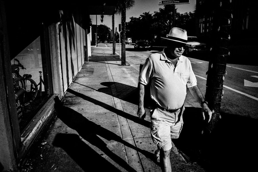
Try this on your next walk. Before you raise the camera, name the two or four biggest shapes in the frame. If you can't, the frame isn't organized yet. Move until it is. Shapes also carry psychological meaning, which is why I cover them in the elements of photography. Treat your camera like a paintbrush and the street like a still life that happens to move.
Lesson 2: Caravaggio and the power of one hard light
Chiaroscuro is the contrast of light and dark in a picture. Tenebrism is its extreme form, where most of the canvas falls into darkness and a single light picks out the subject. Caravaggio made it famous.
Look at The Calling of Saint Matthew (1599 to 1600), painted for the Contarelli Chapel in San Luigi dei Francesi in Rome. Christ enters on the right and points at Matthew. A beam of light crosses the wall and lands on the faces at the table. The light does the storytelling. It tells you who matters and where to look, and the dark hides everything that doesn't.
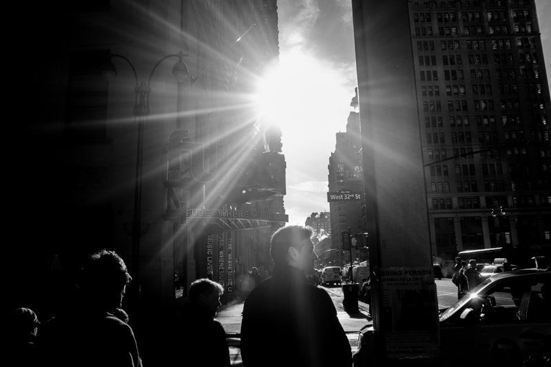
I once made a photo inspired by Caravaggio: a child reaching for the light out of darkness. I borrowed the meaning of his light as much as the look. Light tells the viewer what matters, so treat it as part of the subject.
How to use it on the street:
- Hunt for one light source. A gap between buildings, or a shaft of late sun into an alley.
- Expose for the highlight. Dial in minus one or minus two stops of exposure compensation and let the shadows go black.
- Wait for the subject to step into the light. The stage is already built. You're waiting for the actor.
- Keep the dark clean. If a bright sign sits in your shadow area, move. It will steal the eye.
The word photography literally means painting with light. A painter knows paint; you need to know light the same way. More on reading it in light and shadow photography.
Lesson 3: The eye goes to the brightest point
Vermeer's The Milkmaid (around 1660, in the Rijksmuseum) is a quiet picture of a woman pouring milk. Soft window light comes from the left and falls on her and the table. As the Rijksmuseum puts it, except for the stream of milk, everything is still.
What Vermeer knew is that the eye goes to the part of the frame with the most contrast. That's one of the most useful facts in composition, and it's the first thing I check in my own photos.
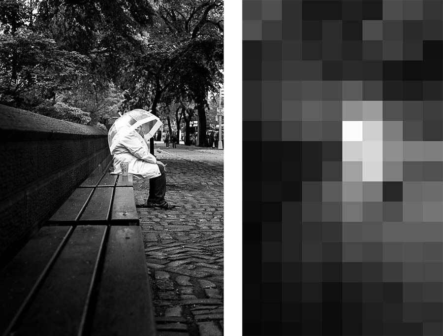
Painters test a composition by squinting until the details disappear and only light and dark masses remain. You can do the same in two ways:
- Squint at the scene before you shoot. If your subject isn't the brightest or most contrasted area, change your angle.
- After the shoot, shrink or blur the photo on screen. If the eye lands on a trash can instead of the face, darken the trash can in editing or pick another frame.
This is also why a busy background ruins a portrait. If the brightest thing in the frame is behind your subject, the viewer's eye goes there first.
Lesson 4: Leonardo's lines that point to the subject
In Leonardo da Vinci's The Last Supper, every line in the room leads to Christ. According to the Cenacolo Vinciano museum, the vanishing point of the perspective sits by Christ's right temple. The edges of the table and the lines of the coffered ceiling run toward it. Then the windows behind him frame his head against the light. Linear perspective and a frame, working together on one subject.
Raphael does something similar in The School of Athens in the Vatican Museums. Plato and Aristotle stand at the centre, under a receding series of arches. Dozens of figures fill the fresco, but you find the two philosophers in a second.
On the street you can't move the buildings, but you can move yourself. Stand where the lines of a sidewalk or a row of windows converge, then wait for someone to walk into the point where they meet. Use a doorway or an arch the way Leonardo used the window. More in leading lines photography and framing in photography.
Lesson 5: Gestures and the gap between them
The most famous gap in art history is on the ceiling of the Sistine Chapel. In Michelangelo's The Creation of Adam, the fingers of God and Adam almost touch. The small space between them carries the whole picture. Caravaggio quoted it: in The Calling of Saint Matthew, Christ's pointing hand is almost a mirror image of Adam's hand.
Painters knew that hands and glances are lines too. A gaze has direction. Two people looking at each other create an invisible line between them. Two hands about to meet create tension, because the viewer waits for the contact.
In street photography, this is where the decisive moment lives. Watch for:
- Two hands about to touch, like a coin passing between a buyer and a vendor.
- A glance that crosses the frame toward something the viewer can also see.
- A pointing finger or an outstretched arm.
- Two figures close together who read as one group, while a third stands apart.
Body language works as strongly as any line in your frame. For the timing side, read the decisive moment, and for why the brain groups things, read Gestalt principles in photography.
Lesson 6: Color that doesn't have to be real
Painters never felt obliged to copy reality. In The Last Supper, Leonardo used what he called aerial perspective: warm colors for the figures in the foreground, cooler greens and blues for the mountains in the distance. The shift in color creates depth, so the air itself seems to sit between you and the background.
That's what I call non-local color. Local color is the "true" color of an object. Non-local color is the color the artist chooses. Imagine your favorite painting. Are its colors real, or did the painter take liberties? Almost always the second.
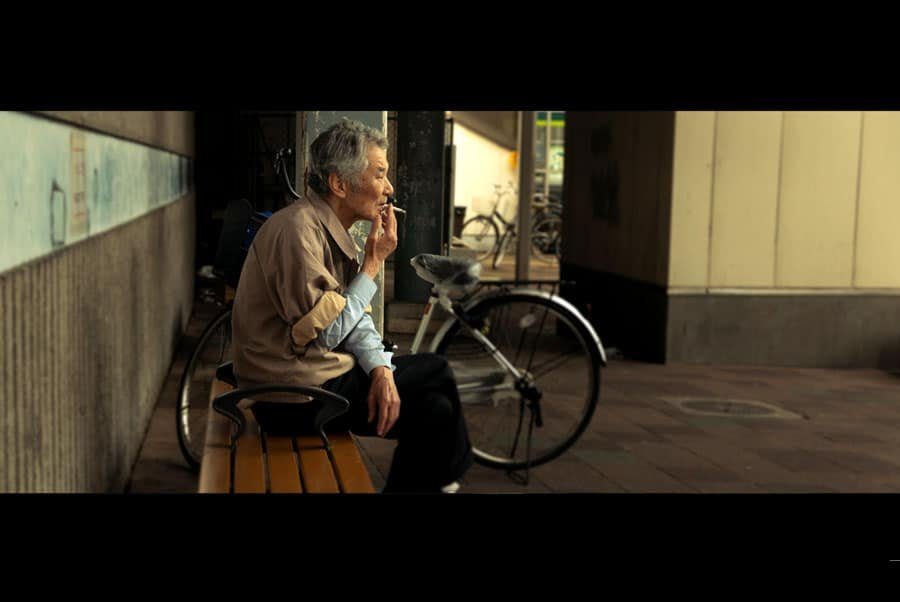
A photographer can do the same in editing. Use the HSL panel in Lightroom to warm the subject and cool the background. Across a series, keep one consistent palette. Rembrandt is easy to spot because he kept returning to the same palette. If you do that too, your color work becomes recognizable as yours. The color photography guide goes deeper, and black and white photography covers the other route: dropping color so the light and shapes carry the picture.
Lesson 7: Judge your work like Leonardo did
Leonardo left practical advice for painters. He wrote that we see mistakes more easily in other people's work than in our own. His fix: look at your painting in a flat mirror, so it appears reversed and "by the hand of some other master". Then its faults jump out.
That trick works on photos. Flip a frame horizontally or view it upside down. Your memory of the moment disappears and you see only shapes and tones. Here are other ways to put distance between you and your work:
- Let the images sit for weeks before you pick the keepers.
- Edit with the interface hidden (the "lights out" view in Lightroom) so nothing competes with the photo.
- Print small versions and look at them from across the room.
- Compare your frame to a painting with the same structure and ask what the painter did differently.
Leonardo was curious about everything, from waves to the flight of birds. Photographers are observers first. The more you notice, the more pictures you find. How to see like a photographer turns that curiosity into a daily habit.
How to study a painting in 10 minutes
You don't need a trip to Rome, though my Italy street photography guide will help if you go. Many major museums publish high resolution images of their collections online. Pick one painting and go through these steps:
- Find the brightest spot. Is it the subject? Usually yes.
- Trace the main lines. Edges, arms, gazes, the tilt of a head. Where do they point?
- Block the big shapes. Squint until the picture becomes a few dark and light masses.
- Look at the empty areas. Negative space is a choice, not leftovers.
- Name one lesson. One sentence, like "a single light on the face, everything else dark".
- Shoot it. Go out with only that lesson in mind and make one street photo that uses it.
Step six is where the value is. Head knowledge means nothing until you've proven it with the camera. Don't copy the painting. Copy the decision behind it, and put yourself into the result.
Learn the Renaissance secrets step by step
This page gives you the short version. Our online street photography course, Phototactic, includes a bonus called "Secrets to creative Street Photography from Renaissance Masters". In it, we look at 7 famous paintings and explain how to apply their secrets to your own photography. The main course teaches the composition keys behind these lessons, from 5 laws that steer where people look to 8 arrangement principles, in short 3 to 5 minute videos.
If you want to keep going on your own first, start with the photography composition hub, then study famous photographers the same way you'd study a painting.
Frequently Asked Questions
What can photographers learn from painters?
Painters teach you how to control where the eye goes. They use one strong light to pick out the subject, lines that converge on it, simple shapes as a skeleton and color chosen for mood rather than accuracy. Study a painting's brightest point and main lines, then use the same decision in your next photo.
What is chiaroscuro in photography?
Chiaroscuro is the use of strong contrast between light and dark to shape a subject. In photography you get it with one hard light source, such as sun through a gap or a single window, and by exposing for the highlights so the shadows fall to black. Caravaggio and Rembrandt are the painters to study for it.
Which painters should photographers study for composition?
Start with Caravaggio for dramatic light, Vermeer for soft window light, Leonardo da Vinci and Raphael for perspective and placement, and Rembrandt for a consistent palette. Street photographers can also look at Edward Hopper for isolation in urban scenes. Pick one painting at a time and name the single lesson it teaches.
Did Henri Cartier-Bresson study painting?
Yes. According to the Fondation Henri Cartier-Bresson, he studied painting under André Lhote in 1926. In 1931 a photograph by Martin Munkácsi pushed him toward photography. His training in geometry and structure shows in how precisely his street photographs are composed.
Is the rule of thirds from painting?
The term comes from painting. It is usually credited to John Thomas Smith, who wrote about it in 1797 in a book on painting landscapes. Painters long before him placed subjects away from the exact centre, and the golden ratio is a related guide, but many Renaissance works also use strong central compositions, so treat the rule as one option, not a law.