
To use color in photography, choose one color relationship per frame and remove whatever fights it. Colors that match pull the frame together, and colors that clash make it pop, but a random mix of both makes it look like a snapshot.
I'm Olivier Duong. I shoot mostly in black and white, and for a long time color was the thing I avoided because I didn't understand it. Once I learned a few color combinations and started paying attention to the meaning behind colors, my color work stopped being one-off lucky frames. The same tools work for anyone, and the short history of color photography explains why color still has something to prove on the street.
What is color photography? Additive and subtractive color
Color photography is photography that records and reproduces the colors of a scene, not just its brightness. Colour photography, as it's spelled in British English, is as much about the use of color as about the process. It works because of how the human eye sees color. The retina has three kinds of cone cells, roughly sensitive to red, green and blue light. Mix those three primary colors of light and you can make almost any hue we can see.
Every color photograph uses one of two ideas:
- Additive color. Red, green and blue light added together. This is the RGB color model used by every image sensor, screen and digital camera. Each pixel on your sensor sits under a tiny color filter.
- Subtractive color. Cyan, magenta and yellow dyes that each absorb (subtract) part of white light. This is how color film, color prints and photographic prints from a lab work. Each layer of emulsion holds a different dye.
You don't need the physics to take good color photos. But knowing that color is light explains why the same red coat looks different at noon and under a streetlamp.
History of colour photography: from early experiments in color photography to Autochrome and Kodachrome
The history of color photography runs from a physics demonstration in 1861 to the phone in your pocket.
| Year | Milestone |
|---|---|
| 1826 to 1839 | Nicéphore Niépce makes the first surviving photograph, and the daguerreotype follows in 1839. Both are monochrome. Some studios hand-colored daguerreotypes with paint. |
| 1840s to 1850s | Experiments in color photography by Edmond Becquerel and Levi Hill record some colors, but the images can't be fixed and fade. |
| 1861 | Physicist James Clerk Maxwell shows the three-color principle. Photographer Thomas Sutton photographs a tartan ribbon three times through red, green and blue filters, and the images are projected together. It's often called the first color photograph made, and it is the first use of color separations. |
| 1860s | Louis Ducos du Hauron describes both additive and subtractive color methods, the basis of almost every later color process. |
| 1891 | Gabriel Lippmann presents a method based on light interference. He receives the Nobel Prize in Physics in 1908. |
| 1907 | The Lumière brothers, Auguste and Louis, release the Autochrome. Each glass plate is covered in microscopic grains of potato starch dyed orange, green and violet. The grains act as a color screen over a black and white emulsion. It's the first commercially successful color process, and Autochrome plates stayed on sale into the 1930s. |
| 1935 | Kodak launches Kodachrome, a color film with rich dye colors and a long life. Color photography slowly becomes practical for everyone. |
| 1942 | Kodacolor, a chromogenic color negative film, makes color paper prints possible for amateurs. |
| 1963 | Polaroid introduces Polacolor, an instant color film. |
| 1976 | The Museum of Modern Art shows William Eggleston's color photographs, a turning point for color as fine art. |
| 2000s | Digital color takes over. Every digital camera and phone records full color, and black and white becomes a choice made in editing. |
The evolution of color photography shows a gap between the invention and the popularity of color. For most of the 20th century, serious photographers and museums treated color as commercial and black and white as art. Street photographers like Saul Leiter and Fred Herzog shot color in the 1950s anyway, and much of their color work only got wide recognition decades later.
Why is there less color street photography?
There is less color street photography because of tradition and because color is so close to reality. Both can be beaten.
Photography began without color, and with such a head start many photographers kept the monochrome tradition even after color film arrived. The bigger criticism is realism. A man waiting for a train in front of a large clock, in color, is just a man in a train station. In black and white, being further removed from reality, the same photo can become a picture about time.
That is true to a degree. But you can pull a color photograph away from reality with a strategy painters used for centuries, and I cover it below. Color also makes it easier to create photos that are immediately recognizable as yours. On Reddit, one photographer admitted they leaned on black and white "because it was easy to hide that I wasn't good at working with colour." If that sounds familiar, you are in good company: many photographers find colour photography harder than black and white. My black and white photography guide covers the other side of the choice.
What makes a good color photograph?
A good color photograph works for the same reasons any good photograph does, and it also fails in black and white. If it looks just as good both ways, the color is decoration, and by definition it isn't a strong color shot.
What makes a good street photograph is what I call the eye, heart and mind. For a color shot, add one test: take the color away and see whether the picture loses something important. I once photographed in a McDonald's when I lived in Korea. What drew me was a strong shape, but mostly a gorgeous red. Converted to gray, the photo still works, but it's not nearly as good.
After the basics, two things decide whether a color shot works:
- Color coordination. Do the colors go together or deliberately clash?
- Color psychology. What do the colors mean to the viewer?
Depending on the image, one matters more than the other.
Color theory photography: the color wheel in plain words
Color theory photography, or the use of color theory in photography, is a short list of color combinations that reliably look good together. You don't need to memorise the whole theory. You need the color wheel and a few relationships on it.
My mom used to stop me at the door and ask, "Are you going out with THIS?" Then she'd make me change, because my shirt and pants didn't match. She was right about color. Some colors go with others, and it isn't only taste. If your colors don't go together, the photo fails on a color level.
| Color scheme | What it is | What it does in a photo |
|---|---|---|
| Monochromatic | Shades of a single hue | Calm, unified, easy to read |
| Analogous | Neighbours on the color wheel, like yellow, orange and red | Harmony, a warm or cool mood |
| Complementary | Opposites on the wheel, like red and green or blue and orange | Maximum color contrast, the subject pops |
| Dominant color with an accent | One color fills most of the frame, a small opposite color marks the subject | The eye goes straight to the accent |
Three more words help when you edit. Hue is the color itself. Saturation is how intense it is. Luminance is how light or dark it is. Color saturation gets overused more than anything else in editing, in colour photography as in still photography of any kind. Strong colors come from strong color relationships, not from pushing a slider.
Color street photography tips: how to use color on purpose
1. Shoot a solo color
The easiest color photograph is one where the whole frame is basically a single color. It doesn't have to be exactly the same color, just close shades of it. A red bench against a red wall works even if the bench is more orange.
2. Like with like
When I wanted to dodge my mom's fashion checks, I'd wear a shirt and pants of the same color. Like with like is the frame version: the same color repeats in several places. In one New York frame, a woman's yellow dress repeats in the cars on both sides and in a sign above, so the eye jumps from one to the next. That gives good eye travel, and it's the law of similarity at work. Solo color is calm. Like with like is dynamic.
3. Make the colors fight
Nothing makes an image pop more than contrast, and color contrast is one of the strongest kinds. Instead of colors that work together, look for colors that fight: red against blue, yellow against purple. That is complementary color photography.
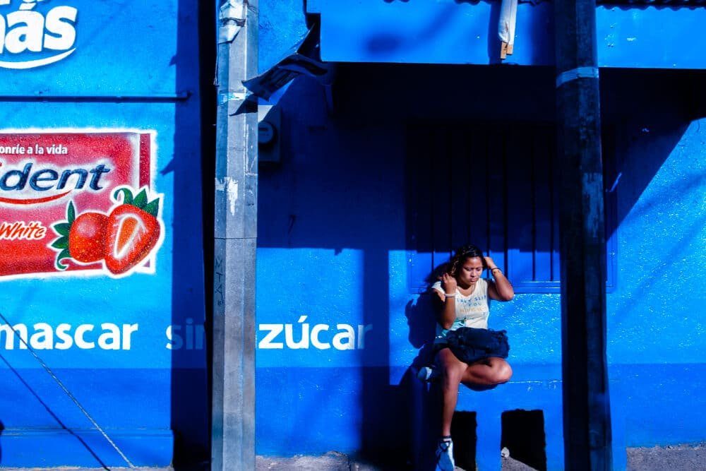
4. Let the subjects carry the color at midday
Early afternoon light gives you boring overall color. It's the color people see most of the day, and what is familiar is boring. That doesn't mean you stay home. In ordinary light, look for color in your subjects: clothes, shop fronts, signs, painted walls.
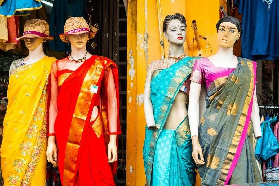
5. Be smart about the time of day
If you want the whole photograph to have interesting color, change when you shoot. Golden hour and blue hour give colors people rarely notice, and so does night. Even non-photographers pull out their phones for a sunset because the color is unusual. Follow the same impulse and look for colors that are normally unseen. Weather counts too: fog and rain mute everything and make a single umbrella glow. See my rain photography guide.
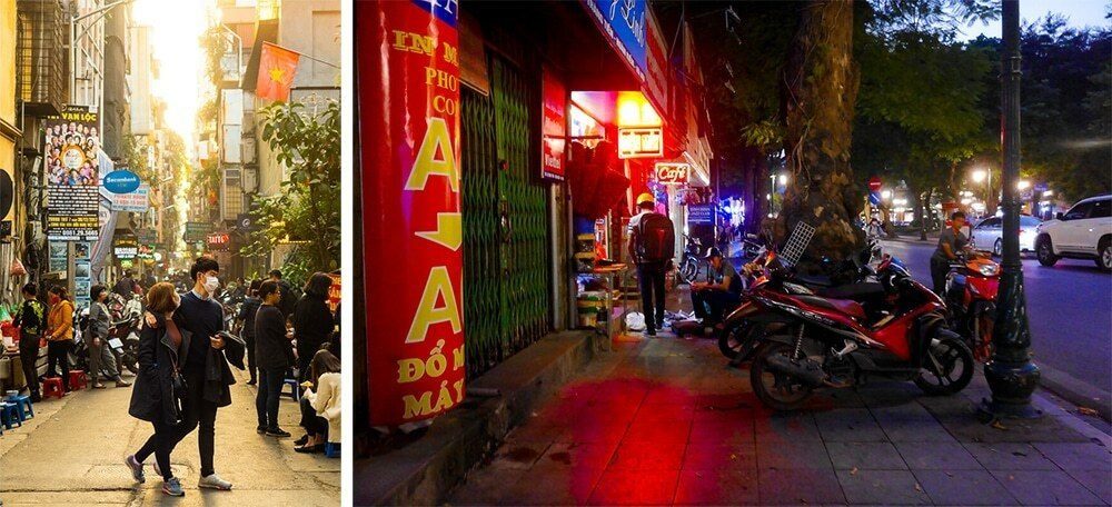
6. Go for non-local colors
Reality is boring, and painters understood that for millennia. Instead of painting the local color of an object, the color it really is, they took artistic liberties. Think of your favorite painting. Do any of its colors match reality? You aren't tied to the colors on your screen either. The red in your shot doesn't need to stay that exact red.

7. Watch your ISO
You can get away with great monochrome images from almost any camera. Not in color. Noise can pass for grain in black and white, but in color it turns into blotchy, ugly color. Keep ISO as low as you can.
Color psychology: what your colors say
Great color photography isn't only about which colors go together. It's also about what the colors mean. Viewers react to color before they think about it, and the symbolism behind a color changes how they read the scene.
- Red: energy and danger. It jumps forward in the frame.
- Blue: calm, distance, cold, sometimes sadness. It recedes.
- Yellow: warmth and caution.
- Green: nature, rest, but also sickness under fluorescent light.
These meanings shift between cultures, so treat them as tendencies, not laws. Color temperature matters just as much. Warm light feels nostalgic and intimate, cool light feels lonely or modern. Change the white balance and you change the meaning of the image. One of the bonuses in my course covers 18 psychological principles every photographer should know, because your real canvas is the viewer's mind.
Camera settings for color photography
You don't need a special camera for color, but a larger sensor or a recent small sensor helps. I shot a Ricoh GR Digital IV from 2011 for years, and its colors often struggle. For black and white it was perfect.
- Shoot RAW. You get the most color information to push in editing.
- Set white balance on purpose. Auto is fine for RAW, but know that you'll set the mood later.
- Protect your highlights. Blown highlights lose their color entirely. Underexpose a touch in bright sun.
- Keep ISO low, since color noise is harder to hide than gray grain.
A Ricoh GR photographer featured in Inspired Eye magazine once told me his secret for strong color on that camera: the Bleach Bypass effect in camera, then more saturation in Lightroom. If you prefer finished JPEGs, film simulations do similar work on Fujifilm cameras. My Fujifilm recipes page has color recipes to start with, and the rest of my settings are in the street photography settings guide.
Editing color photographs: own your palette
Edit color in Lightroom with the Color Mixer (HSL) to control each hue, and the Color Grading panel to tint shadows and highlights. That is where local colors become your colors.
With color you can own a certain look. You can't own a color, but if you stay consistent, viewers start linking it to you. It's easy to spot a Rembrandt painting because he kept returning to the same color palette. Brands do the same: you know a Coca-Cola can by its red before you read a word. For a project of mine, I settled on a look and reused it across every image to keep the set consistent.
If you're serious about color, explore the color palettes you want to be known for. Experiment, save the result as a preset, and keep reusing it. My editing guide walks through the full Lightroom workflow step by step.
Color photographers to study
Studying great color photographers, and how each photographer uses a dominant color, teaches you more than any color wheel. Don't copy their photos. Look at how they use a dominant color and where they place the accent.
- Saul Leiter shot New York through fogged glass, with one red umbrella doing all the work. See my Saul Leiter page.
- Ernst Haas used Kodachrome and motion blur to make color feel alive. See Ernst Haas.
- William Eggleston photographed ordinary Southern scenes in saturated color and helped convince museums that color photographs belong on the wall.
- Fred Herzog photographed Vancouver streets on Kodachrome from the 1950s on.
- Harry Gruyaert builds pictures out of blocks of color and light.
- Joel Meyerowitz shot color on New York streets from 1962, when serious photography was still mostly black and white.
- Martin Parr lit British leisure with flash in loud, saturated color.
- Raghubir Singh made dense color pictures of street life across India.
- Alex Webb stacks hard tropical light and saturated color in one dense frame.
More masters, color and black and white, are in my guide to street photographers.
Learn the formulas behind pleasing colors
Color stops being luck once you can see color relationships before you shoot. That is real control over color, and it matters more than any editing trick for color images. My street photography course teaches the formulas for pleasing colors in your images. It also shows more than 10 ways to contrast elements in a frame, and color contrast is one of them. If you want the composition side first, start with my guide to photography composition.
Frequently Asked Questions
How do you use color in photography?
Pick one color relationship per frame and remove whatever fights it. Repeat the same color in several places for harmony, or place two opposite colors against each other for contrast. Then think about what the colors mean, since red and blue, for example, change the mood in opposite ways. Shoot RAW so you can refine the colors later.
When was color photography invented?
The first color photograph is usually credited to James Clerk Maxwell and Thomas Sutton in 1861, using three images taken through red, green and blue filters. The first commercially successful color process was the Autochrome, released by the Lumière brothers in 1907. Kodachrome film arrived in 1935 and made color practical for most photographers.
What colors photograph best?
Saturated colors against a contrasting or neutral background photograph best, such as a red coat on a gray street or yellow against blue. Colors in soft light hold their saturation better than colors in harsh midday sun, which washes them out. Complementary pairs on the color wheel give the strongest pop, while a single color gives a calm, unified image.
What is complementary color photography?
Complementary color photography uses colors that sit opposite each other on the color wheel, like blue and orange or red and green. Placed together, they create the strongest color contrast possible, so the subject stands out. Many street photographers look for a small complementary accent, like a red umbrella, against a large area of its opposite color.
Can color photos be converted to black and white?
Yes. Any color photo can be converted to black and white in Lightroom or a phone app, and converting from a color file gives you more control than shooting black and white JPEGs. You can decide how light or dark each color becomes. But if color was the reason you took the picture, the conversion usually makes it weaker.