
The elements of photography are line, shape, form, texture, color, tone and space. Composition is how you arrange them inside the frame.
I'm Olivier Duong. Before I picked up a camera I trained as a graphic designer, and design school taught me this vocabulary first. It changed how I shoot. Once you can name the elements of a photograph, you stop saying "I like it" and start saying why it works. That is the skill a Reddit beginner put best: learning "the vocabulary to articulate why an image works." This page gives you that vocabulary, with street photography examples, so you can use it on your next walk.
What are the elements of photography?
The formal elements of photography are the visual building blocks every photograph is made of. They come from the visual arts. Painters and photographers use the same list, because a photograph is a two-dimensional image like a painting or a poster.
Here is the list I use, with what each element does to the viewer's eye.
| Element | What it is | What it does | Street example |
|---|---|---|---|
| Line | A mark with length and direction: straight lines, diagonal lines, curves | Moves the eye and sets energy | A curb, a shadow, a railing |
| Shape | A flat, closed area: geometric or organic | Gives the brain something to recognise fast | A silhouette against a bright wall |
| Form | Shape with volume, shown by light and shadow | Makes a flat image feel three-dimensional | Side light on a face or a column |
| Texture | The surface quality you could almost touch | Adds detail and a tactile feel | Peeling paint, wet cobblestones |
| Color | Hue, saturation, brightness and temperature | Carries mood and guides attention | One red coat in a gray crowd |
| Tone | Lightness and darkness, from highlights and shadows to midtones | Decides where the eye lands first | A figure in a pool of light |
| Space | Positive space (the subject) and negative space (around it) | Gives the subject room or makes it feel crowded | A lone walker in an empty plaza |
These are the basic elements of art, and they work the same in portraiture, still life, macro photography or outdoor photography as they do on the street. Some teachers add pattern and point, which is how you get lists of nine or ten elements in photography. Others fold form into shape and tone into color, which gives you five. The count matters less than the habit of seeing them.
Composition = visual elements x arrangement principles
This is the formula I built my teaching on. The elements are the raw material. The principles are what you do with them.
Think of it like language. Elements are words. Principles are grammar. A pile of words is noise, and a frame full of elements with no arrangement is clutter. That is why so many street photos look like snapshots. They have a subject but no order.
My job on the street is to bring visual order to chaos. I want the image to look as if it was built by hand, even though I only had a split second. The elements and principles are how I do that.
One idea shapes everything below: your real canvas is not the street or the blank frame. It is the viewer's brain. Every element in your photograph has an effect on that brain, planned or not.
Line: the element that moves the eye
Line is the most active element. The eye follows it. Horizontal lines feel calm, like a horizon. Vertical lines feel strong and still. Diagonal lines feel like motion, and a curve feels softer and slower.
On the street, lines are rarely drawn for you. The brain builds them. When there are many things in the frame, it simplifies. It doesn't see a row of houses. It sees one straight line. It doesn't see a man on a bike with his kid. It sees a vector pulling toward the bottom left.
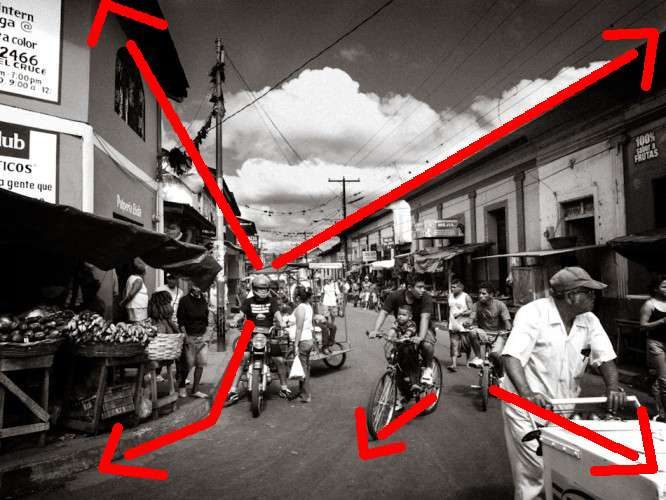
So look at a scene as a set of lines first. Where do they point? If they point out of the frame, the viewer leaves with them. If they point at your main subject, they deliver the viewer's attention exactly where you want it. The full guide is here: leading lines photography.
Shape and form: what the brain sees first
Shape is flat. Form is shape with depth, the three-dimensionality that light and shadow give an object. A person in backlight becomes a shape, a black silhouette. The same person in side light becomes a form, rounded by light and shadow.
The brain reads broad shapes before it reads detail. That is how it avoids overload. For a street photographer it means the big shapes in the frame decide how the photograph works before anyone notices the faces. I squint at a scene to see its skeleton: the main blocks of light and dark and the shapes they make.
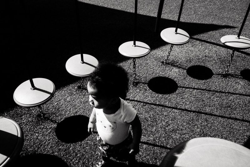
In the frame above, the round tables and their round shadows repeat across the ground. The law of similarity groups them into one pattern, so the child is the only shape that breaks it. That break is where the eye lands.
Geometric shapes (squares, circles, triangles and grids) feel man-made and ordered. Organic shapes feel natural and loose. Street photography mixes them all the time: a round umbrella against a rectangular doorway is a contrast of shapes, and contrast pulls the eye.
Texture: the element you can almost touch
Texture is surface: rough stone, rusted metal, rain on glass, the weave of a coat. It rewards the viewer who looks longer. It also tells the story of a place. Old walls in Havana and polished glass in Tokyo say different things before a single person enters the frame.
Texture needs light at a low angle. Side light makes every bump cast a tiny shadow. Flat light at noon under clouds hides it. If you want texture, shoot early or late, or find a wall where the light skims across it.
Texture also works as a background. A textured wall behind a clean subject gives the frame depth without competing for attention, as long as the tone of the subject stands apart from it.
Color: mood, meaning and eye travel
Color is the loudest element and the fastest way to add visual impact. Warm colors (reds, oranges, golden hues) come forward and feel active. Cool colors (blue tones, greens) sit back and feel calm. Saturated color grabs attention. Muted color feels quiet.
These color arrangements work on the street every day.
- Like with like. Repeat one color across the frame. The eye jumps from one patch to the next, which gives the image movement and order at once.
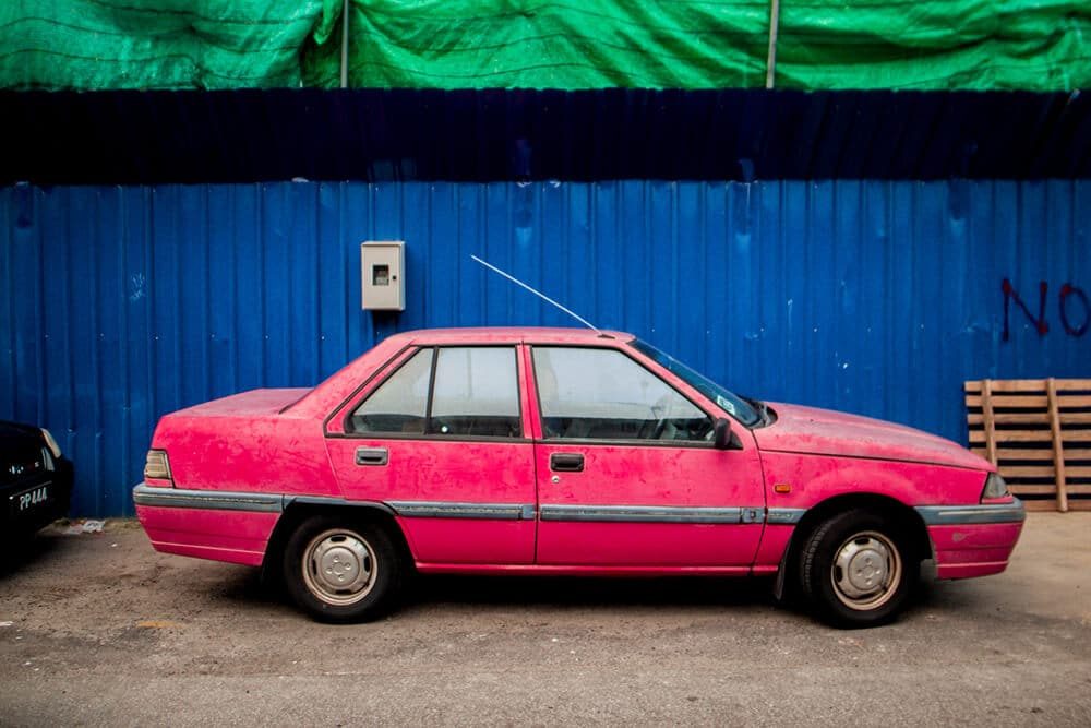
- Make the colors fight. Put opposite colors side by side, like red against blue. The contrast makes the image pop.
- Solo color. Let one color fill almost the whole frame, so the color itself becomes the subject.
- Non-local color. Shift colors in editing away from what you saw, the way painters always have. Reality is often boring.
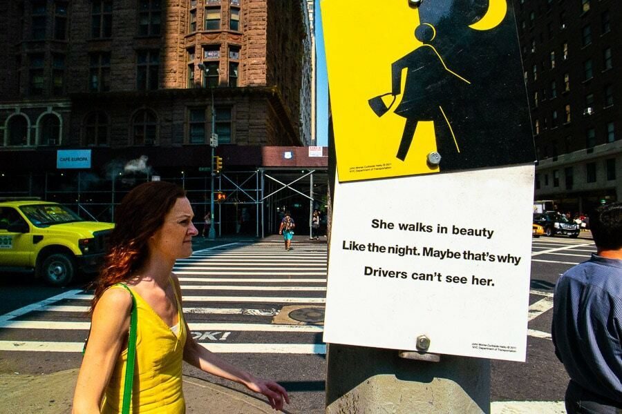
Here's a test I use. A good color photograph should fail in black and white. If it works just as well in monochrome, the color was not doing any work.
Tone and light: the element under all the others
Tone is lightness and darkness. In monochrome photography it is almost everything, because the tonal range is all you have left. In color it still decides where the eye goes first: the brightest area, or the area with the most contrast, wins.
Tone comes from light. The quality of light (hard or soft, warm or cool, front light or backlight, direct or diffused) changes every other element. Hard light makes strong shadows, which become shapes and lines of their own. Backlight turns people into silhouettes. Soft light shows form and texture gently. Different lighting gives the same street a different mood, and mood is often what the viewer remembers.
Ansel Adams built a whole method around tone. His Zone System, developed with Fred Archer, splits the scale from black to white into zones so a photographer can place each tone on purpose. You don't need the full system on the street. You do need the habit behind it: look at the highlights and shadows before you press the shutter.
Exposure is where tone meets the camera. Aperture, shutter speed and ISO are technical aspects of photography, not visual elements, but they control how tone is recorded. If you want the basics for the street, read street photography settings. For light itself, read light and shadow photography.
Space: positive and negative space
Space has two sides. Positive space is the area your subject fills. Negative space is the empty area around it. A small figure in a lot of negative space feels alone. A face filling the frame feels intimate, even confrontational.
Space also means depth: the illusion of distance in a two-dimensional image. Perspective creates it. Overlap creates it. So does a change in size between near and far things. Street photographers stack depth in layers, with a foreground and a background, often with a middle layer between them.
Two guides go deeper: negative space photography and layering photography.
The principles of photography that arrange the elements
The principles of design are how you organise the elements. This is where most photographers never get taught anything. I have rarely seen these principles taught outside graphic design circles.
These are the ones I lean on most on the street.
- Contrast. The difference between two things: light and dark, big and small, still and moving, sharp and soft. It is the most powerful principle I know.
- Emphasis. One focal point wins, even when there are several points of interest. If you can't point to the main subject in a second, neither can the viewer.
- Balance. Visual weight spread so the frame has a sense of balance. Symmetry is the formal version. Asymmetry is the dynamic one.
- Repetition and pattern. The same shape, color or line repeated gives rhythm. Break the pattern once and the break becomes the subject.
- Movement. Lines, gestures and gazes that carry the eye through the frame.
- Unity. Everything belongs. Nothing in the background fights the subject.
Under these sit the Gestalt laws, which explain how the brain groups what it sees. The law of similarity links things that look alike. The law of proximity groups things that sit close together. The law of continuity follows lines and curves. Figure and ground separates a subject from its background. You saw two of them at work in the Haiti photo above.
Types of composition in photography
Types of composition are ready-made arrangements of the elements. They are useful starting points, not laws. The most common ones:
- Rule of thirds: the subject on a third line or crossing point. Covered in photography composition.
- Centered and symmetrical: the subject in the middle, with balance on both sides.
- Diagonal: the main line runs corner to corner for energy.
- Frame within a frame: a doorway or window nests the subject. See framing in photography.
- Leading lines: lines point at the subject.
- Layering: foreground, middle and background each hold something.
- Juxtaposition: two elements side by side create a new meaning. See juxtaposition photography.
- Negative space: a small subject in a big empty area.
Every one of these is just elements plus principles. Leading lines is line plus emphasis. Juxtaposition is contrast between two shapes or two meanings. Once you see that, you don't need to memorise composition types. You can build your own.
How to train your eye to see the elements
Understanding elements is only half of the art of photography. Knowledge is not enough. On the street you have a second or two. The elements have to work in your subconscious, not as a checklist you run in your head.
Here's what I suggest.
- Take one element per walk. Only lines today. Only shapes tomorrow. Shoot nothing else.
- Squint. Blur your vision until the detail goes and only the big shapes and tones remain.
- Study photographs you love. Name every element in them. Do the same with paintings and abstract art, where photographic composition rules came from in the first place. Then name the principle that arranges them.
- Review your own frames the same way. A weak frame usually has elements with no arrangement, or two elements fighting for attention.
- Look at painting and design. Painters solved these problems centuries before cameras existed.
This is what I mean by "picture patterns". You install the patterns in your mind before you go out, so your eye spots them without effort. In our online street photography course, Phototactic, the composition module covers six visual elements, eight arrangement principles and five laws that make people look where you want them to. If you are still at the stage of judging what makes a good photograph, start there, then come back to this list.
Frequently Asked Questions
What are the 7 elements of photography?
The seven elements of photography are line, shape, form, texture, color, tone and space. Some lists swap tone for value or add pattern. They are the visual building blocks of any photograph. Composition is the way you arrange them in the frame so the viewer's eye goes where you want it.
What is the difference between elements and principles of photography?
Elements are the raw material, like line, shape and color. Principles are how you arrange that material, like contrast, balance, emphasis and repetition. A photo can be full of elements and still fail if nothing organises them. Think of elements as words and principles as the grammar that turns them into a sentence.
What are the 5 elements of photography?
A five-element list usually keeps line, shape, texture, color and space, and folds form into shape and tone into color. Other teachers use light, subject, composition, moment and emotion as their five. The labels change from one teacher to the next. What matters is being able to spot each element in a scene.
Is light an element of photography?
Light is what makes every other element visible. Many lists include it as tone or value, meaning the range from highlights to shadows. The quality of light, hard or soft, warm or cool, changes how line, shape, form and texture appear. That is why photographers treat light as the foundation.
Are aperture, shutter speed and ISO elements of photography?
No. Aperture, shutter speed and ISO are exposure settings, the technical aspects of photography. They control how light is recorded and how much of the scene is sharp. The visual elements are what you see in the final image. Settings affect the elements, for example a shallow depth of field turns a busy background into soft bokeh.