
Juxtaposition in photography means placing two or more elements side by side in one frame so the relationship between them creates the meaning. Usually the elements contrast, like young and old or a billboard smile next to a tired face, and the viewer's brain does the rest.
I'm Olivier Duong, co-founder of Inspired Eye. Juxtaposition is the quickest way to turn "a person on a street" into a picture with an idea in it.
Definition of juxtaposition: what it means to juxtapose two or more elements
To juxtapose is to put things next to each other for comparison. In a photograph, that means you frame two subjects, objects or concepts together so the viewer compares them. The comparison is the point. Neither element carries the image alone, and the disparity or dissimilarity between them is what makes the picture eye-catching.
Most juxtapositions run on contrast. I've called contrast the most powerful visual principle, because it is not either extreme that holds attention. It is the energy between the two. Tall versus short, old versus new, loud versus quiet, man-made versus wild: the gap between them pulls the eye and starts the story.
Juxtaposition can also run on similarity. A cloud shaped like the sign below it, or a dog that looks like its owner, surprises because two unrelated things rhyme. Either way, the definition of juxtaposition stays the same: two or more elements whose relationship says more than each one does alone.
It overlaps with other composition tools. Layering puts subjects at different depths. Juxtaposition asks what those subjects say to each other. A layered frame often becomes a juxtaposition once the layers start to argue.
14 types of juxtaposition: contrasting elements, colour and more
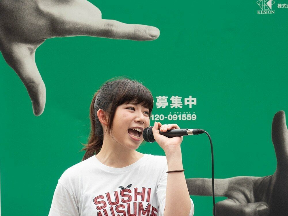
Each of these contrasting elements is a picture pattern you can carry in your head.
1. Young versus old
A child next to an elderly person, or a teenager walking past a poster of a pensioner. Age contrast reads instantly and carries a quiet message about time.
2. Big versus small
A tiny person against a skyscraper, or a huge dog beside a small one. Scale contrast is the simplest juxtaposition to find in any city.
3. Nature versus man-made
A tree pushing through concrete, or a tractor on a city street. The wilderness meeting the built world is a classic theme.
4. Billboards and murals versus real people
Advertising is a gift. A perfect face on a poster above a real, tired one. A painted hand that seems to hold a passerby. Don Springer, who shot Philadelphia for more than 50 years, calls the city great for juxtaposing billboards with people passing by.
5. Text versus reality
A "No Parking" sign over a parked car, a shop called "Paradise" on a grim block. Words in the frame set up an expectation the scene breaks.
6. Light versus dark
A figure in a patch of sun surrounded by shadow. The juxtaposition of light and dark is pure form, and your eye always goes to the part with the most contrast.
7. Colour contrast
A red coat against a green wall, one bright umbrella in a gray crowd. Complementary colours sit side by side and both look stronger. A bright coat against a stormy sky or a dark background works the same way.
8. Movement versus stillness
Use a slow shutter speed so the crowd blurs while one person stands still. The single person who stands still becomes the subject because every pedestrian around them moves.
9. Emotion versus emotion
One person laughing while the person beside them looks worried. Body language and gaze carry this one, so watch faces and gestures.
10. Humans versus animals
People and animals copying each other or trading roles. Garry Winogrand built a whole book, The Animals, around the odd contrasts between visitors and animals at the zoo.
11. Shape echoes
Two things with the same shape, like a round hat under a round window. This is the law of similarity at work: the brain groups things that look alike.
12. Reflections: two worlds in one frame
A shop window lays the street over the interior. Reflections let you place two scenes in one image without any trickery.
13. Forced perspective
Line up a near object with a distant one so they seem to touch, like a person who appears to hold up a tower. It can look surreal and fun, but it is easy to overdo.
14. Wealth versus poverty
A luxury store next to someone asking for change. This is powerful social commentary, and it deserves care. Ask whether the picture respects the person or just uses them as a prop.
Famous examples of juxtaposition in street photography
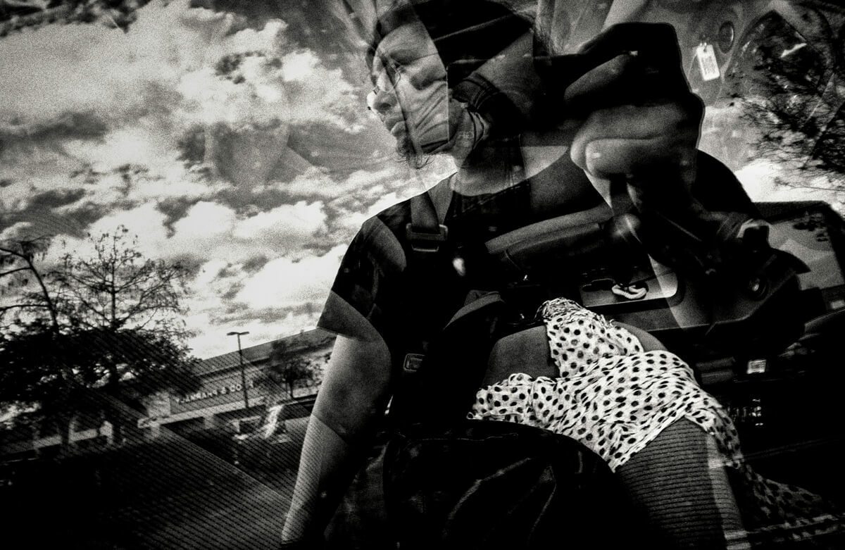
- Elliott Erwitt. Famous for visual wit, especially dogs and their owners. His picture of a woman's legs next to a Great Dane's legs and a tiny chihuahua is a textbook big versus small joke.
- Lee Friedlander. A master of visual puns. In one of his American roadside pictures, a cloud and a sign combine into an ice cream cone. At first it looks like a snapshot. It rewards you for looking longer.
- Garry Winogrand. Beyond The Animals, his crowded frames often pair gestures that seem to comment on each other.
- Matt Stuart. A London photographer known for humour and coincidence, where unrelated people and objects line up for a split second.
- Paul McGuirk. Featured in the second issue of Inspired Eye, his thing was funny juxtapositions. One image shows a shoeless man in front of a shoe store.
Craig Whitehead is a more recent name worth studying. His work leans on light, shadow and colour, and many of his frames juxtapose a small figure against bold graphic shapes.
How to find juxtapositions instead of waiting for luck
Most people think juxtaposition is pure luck. Some of it is. Most of it is preparation.
- Find the stage first. Look for a strong, fixed element: a billboard, a mural, a shop sign, a statue. That is half of your juxtaposition.
- Imagine the missing half. Ask what kind of person or action would contrast with it. A serious suit under a cartoon. A runner under a sign that says "Relax".
- Set your trap. Frame the scene and pre-focus. Then wait. Patience is the street photographer's best friend. Give it ten minutes before you leave.
- Place each element strategically. Put the fixed element in the foreground or to one side within the frame, and leave a clear space where your second subject will land.
- Keep both elements readable. If one element is too small or buried in clutter, the connection is lost. Get closer or use negative space around the pair.
- Shoot the sequence. The moment when a gaze meets a poster lasts a fraction of a second. Take several frames.
One question clarifies everything when you edit: would this photograph still work without its most obvious element? If the answer is yes, the juxtaposition is decoration. If the answer is no, it is the photograph.
My honest take: meaning beats the visual joke
I'll be honest. Funny juxtapositions are not what draws me to street photography. What draws me is life: people and the places they live in. A pure visual joke gets a smile for one second and then it is forgotten.
That does not make juxtaposition useless. It makes it a tool. The strongest juxtapositions make a thought-provoking image. A clever pun gets a smile. A strong juxtaposition evokes a feeling or provokes a question. The contrast between two elements says something true about the people in the frame or the place they live in.
Reddit threads on street photography are full of the same tired tropes: silhouettes stepping into light, upside down puddle reflections. They can work. But if a pun is all a picture has, ask what else it could say. Put an offbeat element in the frame to break the expected, and make sure the break means something.
Learn juxtaposition as a picture pattern
Juxtaposition gets easier once you know the patterns before you leave home. Your eye starts spotting the billboard and the passerby as a pair, not two separate things.
That is how my street photography course, Phototactic, is built. It teaches more than 10 ways to contrast elements in your image to create interest, as part of the composition keys module. Each module comes with a cheat sheet, and the "Image Quest" sheet lives on your phone with patterns to hunt for. It does not include feedback on your own photos, so you practice on your own.
For the bigger picture, see my guide to photography composition, and my notes on why street photos look boring if your frames still lack a story.
Frequently Asked Questions
What is juxtaposition in photography?
Juxtaposition in photography is placing two or more elements side by side in one frame so the viewer compares them. The elements usually contrast, like old and new or big and small. The meaning comes from the relationship between them, not from either element on its own.
Can you give me an example of juxtaposition in photography?
A classic example is a person walking past a billboard whose model mirrors or contradicts them, like a tired commuter beneath a glowing smile. Elliott Erwitt's photo of a woman's legs beside a Great Dane and a tiny chihuahua is a famous big versus small example.
What are 5 examples of juxtaposition?
Five common examples are young versus old, nature versus man-made, big versus small, light versus dark, and billboards versus real people. Others include movement versus stillness, text versus reality, reflections that merge two scenes, and shape echoes where two unrelated things share a shape.
What is the difference between juxtaposition and contrast?
Contrast is a difference between two things, like light and dark or large and small. Juxtaposition is the act of placing things together so that difference, or a surprising similarity, creates meaning. Most juxtapositions use contrast, but contrast alone, like a bright spot on a dark wall, is not always a juxtaposition.
How do you find juxtapositions in street photography?
Start with a fixed element such as a billboard or mural. Imagine what kind of person or action would contrast with it. Then frame the scene and wait. Keep both elements readable and shoot several frames, since the moment when they connect is often very short.